Calligraphy Logo Design Process for a Metaphysical Fiction Series
I had the opportunity to design a calligraphy logo for my writer friend Sandeep Adnani for his metaphysical fiction series – The Exiled Rogue. Having published the first book in the series, he was in the process of finalizing the sequel and wanted a single visual mark to represent the series as a whole. It was to be a trilogy. Sandeep sent me some references that he had been collecting and I began to work on it.
Sketches and Thumbnails
I looked at several corporate logos from the Middle-East as a starting point because Sandeep was very fond of the aesthetic he observed in Arabic logos. I started with rough pencil sketches, laying out the series title along different geometric shapes. This practice helped me to clarify the structure of the name and how the particular word shapes fit together. The next step was to figure if the word shapes worked well with the geometric frameworks I started with.
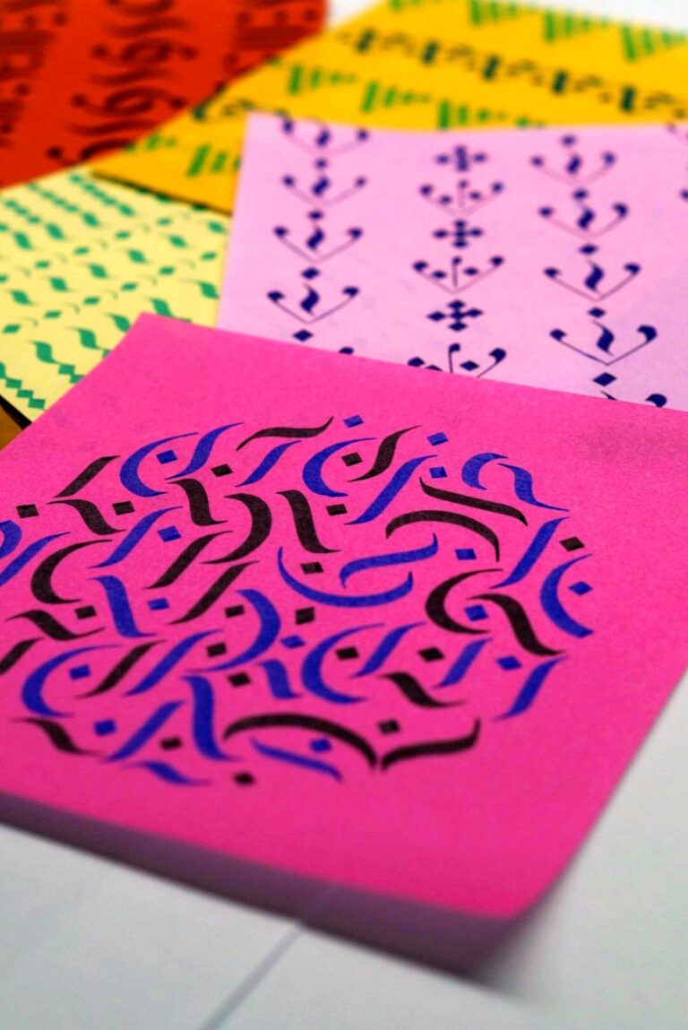
I narrowed down the choices to a circular shape. The Arabic script is curvilinear and using the circle lent a similar visual impression to the Roman letters.
Gothic Calligraphy
Gothic, Blackletter, Old English and Fraktur writing scripts flourished in the manuscripts of medieval Europe. These scripts have distinct vertical strokes with condensed spacing. I chose the Gothic script for this logo design because the combination of broad and hairline strokes give it a visual weight. In addition, the flourishes and diamond strokes give it a presence that is similar to traditional Arabic lettering.
After deciding on the Gothic script, I created some versions of the individual words of the series title in different letter cases, sizes and flourishes. I used the Pilot Parallel Pen to create these versions. This pen is ideal for broad-edged lettering and I use it for both draft and final calligraphy pieces. As a final step in the analogue part of this process, I shortlisted options based on readability, aesthetics and the brief provided by Sandeep.
The next step was to digitize my handlettered words so that it could be executed as a final piece for production on the computer. I am still learning how to design digital lettering and for this project I collaborated with Samir Bharadwaj who is a graphic designer.
Design Options
Samir created several digital layouts of the draft logo in Inkscape to test out the combinations of the variations I provided. We experimented with curved and straight baselines and used different digital fonts to complement my handlettering. I shared these options with Sandeep to get his feedback on which version represented his vision the best.
Developing the Logo
Sandeep’s feedback was that he wanted to integrate swashes that were more evocative of the flourishes of Arabic lettering. He was also enthusiastic about integrating the logo into a cohesive shape to give it a more stamp-like quality. Based on his recommendation we designed a fragmented circle of flourished swashes which encapsulated the title giving it an Arabic look.
Refining a Calligraphy Logo
With all visual design the greatest temptation is to add more elements and complicate things further. The logos that work best avoid that trap and include only the most essential elements. Keeping only the essential elements and the minimal embellishments required to make it recognizable and unique. Having removed the extra flourishes which were not contributing to the harmony of the logo we arrived at the final logo design.
Here’s a quick visual walkthrough of the entire logo-design process from sketch to the digital final.
A Calligraphic Logo in the Wild
‘The Exiled Rogue Series’ by Sandeep Adnani is now a super successful trilogy of books in multiple categories and can be found on Amazon. Our logo has travelled with Sandeep across the world as he promotes and celebrates the success of his book and spreads it to new readers. Here are some pictures from Sandeep’s book signing events.
exiledrogue-calligraphy-logo-booksigning-01
exiledrogue-calligraphy-logo-booksigning-02
exiledrogue-calligraphy-logo-booksigning-03
Calligraphy Logo
This was a really enjoyable process and I hope to continue designing interesting and quirky handlettered calligraphy logos for creative people.